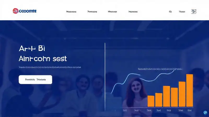
The landscape of e-commerce is fiercely competitive, demanding constant innovation and refinement to capture customer attention and drive sales. Simply having a beautiful website and a great product isn’t enough anymore. Landing pages, specifically, are pivotal in the conversion funnel – they’re the first real interaction a potential customer has with your brand and often determine whether they continue their journey. However, many businesses launch landing pages with assumptions about what will resonate with their audience, only to discover they’re falling short. That’s where A/B testing comes in, providing a data-driven approach to dramatically improve their performance and boost overall revenue. This article will delve into how strategically implementing A/B testing can transform your e-commerce landing pages from passive displays into powerful conversion tools.
A/B testing isn’t about guessing what customers want; it’s about systematically uncovering what actually works. It involves creating two variations of a landing page – the “control” version and the “variation” – and then showing each version to a segment of your traffic. By tracking key metrics like click-through rates, conversion rates, and bounce rates, you can objectively determine which version performs better. This iterative process of testing and refining allows you to continually optimize your landing pages, leading to a significant return on investment. Let’s explore some key tactics and considerations for leveraging A/B testing effectively within your e-commerce strategy.
1. Headline and Value Proposition Testing
Headlines are arguably the most crucial element of any landing page, directly influencing whether a visitor sticks around. Testing different headlines allows you to discover which one most effectively communicates your offer and resonates with your target audience. Don’t just assume a generic headline like “Shop Our New Arrivals” is the best; try variations like “Unlock Exclusive Discounts – Shop Now!” or “Get [Benefit] with Our [Product Category]”. Furthermore, experiment with different lengths – a shorter, punchier headline might grab attention, while a longer, more descriptive one could provide more context. Crucially, consistently track the impact of each headline on your conversion rate to pinpoint the most effective messaging. Remember to keep your headline concise and immediately relevant to the visitor’s needs.
Consider A/B testing the placement of your value proposition as well. Often, a bold headline sits above the fold, but moving it below or incorporating it subtly within the main image can yield different results. Different audiences respond to different approaches. Using a visual element, like a compelling hero image, paired with a clear and concise value proposition is a tried and tested method. Don’t be afraid to try contrasting headlines – a benefit-driven headline versus a feature-focused one can highlight different aspects of your product. Always analyze the data to understand why certain headlines outperform others – are they more emotional, more informative, or simply more aligned with customer desires?
2. Call-to-Action (CTA) Optimization
Your call-to-action is the gateway to converting visitors into customers. A poorly designed or worded CTA can significantly hinder your conversion rates. Testing different button colors, text, and placement is a fundamental A/B testing strategy. A bright, contrasting color can draw the eye, while clear and action-oriented language like “Shop Now,” “Add to Cart,” or “Get Started” is vital. Experiment with the button’s size and shape – larger buttons are often perceived as more trustworthy, while rounded corners can be more inviting.
Placement is equally important. Testing different locations on the page – above the fold, within the main content, or at the bottom – can dramatically affect click-through rates. Consider using multiple CTAs throughout the landing page to reinforce your desired action. For example, include a CTA after explaining a key benefit and another after showcasing a compelling image. It’s not just about what you say, but where you say it. A/B testing can reveal which CTAs are most effective at guiding visitors through the purchase funnel.
3. Image and Visual Testing
High-quality, relevant visuals are essential for engaging e-commerce visitors. But simply using a generic image isn’t enough. A/B testing different images, including product shots, lifestyle images, and videos, can significantly impact your engagement and sales. Test different angles, lighting, and compositions to see what resonates most with your audience. Consider the emotional impact of your visuals – do they evoke feelings of desire, trust, or excitement?
Furthermore, experiment with the size and placement of images. Larger images can capture attention, but too many images can clutter the page. Ensure your images are optimized for fast loading speeds to avoid frustrating visitors. Test whether product images with lifestyle shots (showing the product in use) perform better than simple product shots. Always prioritize images that clearly showcase the benefits of your product and connect with your target audience’s needs and desires.
4. Form Field and Content Testing
If your landing page requires users to fill out a form (e.g., for lead generation or newsletter sign-ups), A/B testing the form’s content and field order can greatly improve completion rates. Test the number of fields you require – asking for less information can encourage more people to submit the form. Experiment with different field labels and descriptions to ensure they’re clear and concise.
Consider using conditional logic in your forms – only displaying relevant fields based on the user’s responses. Also, test different layouts of the form – a single-column layout is often easier to read than a multi-column layout. Don’t be afraid to test different incentives for completing the form – offering a discount code or free shipping can significantly increase sign-up rates. Analyze drop-off points in the form to identify areas where users are struggling and adjust the form accordingly.
5. Page Layout and Design Testing
The overall layout and design of your landing page play a crucial role in user experience and conversion. A/B testing different layouts – such as a single-column versus a multi-column design, or different arrangements of content elements – can reveal which structure is most effective at guiding visitors towards conversion. Experiment with whitespace – ample whitespace can make your landing page feel more clean and uncluttered, while strategic use of whitespace can draw attention to key elements.
Consider testing different navigation elements – a clear and intuitive navigation menu is essential for guiding visitors through your website. Also, experiment with different font sizes and styles to ensure readability and create a visually appealing design. A/B testing can help you identify which layout and design elements best support your overall message and encourage visitors to take action. Remember to ensure your design is mobile-responsive, as a significant portion of your traffic likely comes from mobile devices.
Conclusion
Implementing a robust A/B testing strategy for your e-commerce landing pages is no longer a luxury – it’s a necessity for sustained growth and competitive advantage. By systematically experimenting with different elements – from headlines and CTAs to images and form fields – you can gain valuable insights into what truly resonates with your target audience and drive significant improvements in your conversion rates. Don’t be afraid to iterate and refine your landing pages based on the data, continuously striving to create a seamless and persuasive user experience. Ultimately, consistent A/B testing empowers you to make informed decisions, maximize your return on investment, and achieve your e-commerce goals. Remember, the best landing page is one that is constantly evolving and adapting to the needs of its visitors.