
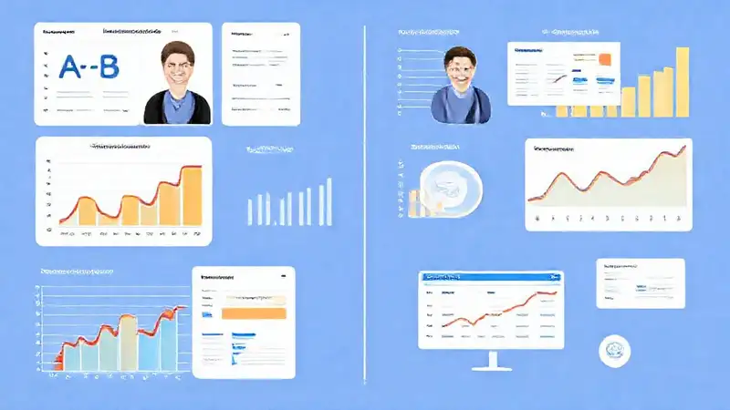
The landscape of online business is shifting dramatically, with membership sites experiencing a resurgence in popularity. Unlike traditional websites relying solely on one-time sales, membership models offer recurring revenue streams and foster deeper customer engagement. However, simply launching a membership site doesn’t guarantee success. Conversion rates – the percentage of visitors who become paying members – are crucial for long-term profitability. A significant challenge for many is understanding which strategies truly drive sign-ups. This is where A/B testing becomes an indispensable tool, allowing you to iteratively improve your website’s elements and ultimately increase your member base. Let’s delve into specific A/B testing methods that can dramatically boost your membership site conversions.
1. Headline and Value Proposition Testing
A compelling headline and a clear articulation of the value proposition are foundational to attracting members. Many sites launch with a generic headline or fail to adequately communicate the benefits of joining. A/B testing various headlines – from benefit-driven statements like “Unlock Your SEO Secrets” to problem-solving phrases like “Stop Struggling with Keyword Research” – can reveal which resonates most powerfully with your target audience. Don’t just test different wording; experiment with the format itself. Try using numbers (“5 Proven SEO Strategies”) or evoking curiosity (“The Secret to Ranking Higher”). Furthermore, ensure the value proposition is instantly apparent; a concise summary of what members will gain is vital for immediately grabbing attention and encouraging them to explore further. Testing this foundation ensures you’re presenting your offering in the most attractive light.
2. Pricing Page Optimization
Your pricing page is often the final hurdle before a potential member commits to a subscription. It’s where they’ll weigh the cost against the perceived value. A/B testing different pricing tiers, payment plans (monthly vs. annual), and even the presentation of the price itself can lead to substantial improvements. Experiment with framing – instead of simply stating the price, highlight the savings or the value gained compared to alternatives. Consider showcasing testimonials or case studies to demonstrate the effectiveness of your membership. Furthermore, testing different payment gateway icons or strategically placed “Limited Time Offer” badges can create a sense of urgency and drive immediate sign-ups. This focused optimization allows you to find the sweet spot that maximizes revenue.
3. Call-to-Action (CTA) Button Variations
The call-to-action button is arguably the most important element on your membership landing page. It’s the direct prompt that urges visitors to become members. A/B testing various CTA button text, colors, and placement is essential. Don’t just stick with “Sign Up Now”; try options like “Join Today,” “Unlock Your Access,” or “Become a Member.” Color plays a significant role – generally, contrasting colors stand out more effectively. Experiment with button size and shape to see what feels most inviting. Crucially, consider where you place the button – above the fold (visible without scrolling) is often most effective, but testing different positions can reveal optimal placement. Powerful CTAs are paramount.
4. Form Field Reduction
Long, complex registration forms can be a major barrier to conversion. Each additional field requires a greater commitment from the potential member and increases the likelihood of abandonment. A/B testing the number of fields you require – starting with a minimal set of information (name, email, and password) and gradually adding more only if absolutely necessary – can significantly improve your sign-up rate. Consider using progressive profiling, gathering more detailed information over time after the initial signup. Also, streamline the form’s layout and clear labeling to minimize confusion and enhance the user experience. Reducing form friction is often a surprisingly effective strategy.
5. Social Proof and Testimonials
People are heavily influenced by the experiences of others. Incorporating social proof – testimonials, case studies, and user reviews – can dramatically build trust and reduce hesitation. A/B testing different types of social proof and their placement can reveal what resonates best with your audience. Showcase short, impactful testimonials highlighting specific benefits of your membership. Use high-quality images of members enjoying the benefits. Consider displaying the number of members already enrolled to create a sense of community and popularity. Utilizing social validation can be a powerful conversion booster.
Conclusion
Ultimately, effective A/B testing isn’t about making random changes; it’s about data-driven decision-making. By systematically testing different elements of your membership site – from headlines to pricing pages – you can identify what truly motivates potential members and optimize your conversion funnel. Remember to always test one variable at a time to accurately measure the impact of each change. Continuous testing and iteration are vital for sustained growth and success in the competitive membership market. Don’t treat A/B testing as a one-time activity; embrace it as an ongoing process to continually refine your offering and drive membership growth.