The rise of membership sites has presented a fantastic opportunity for creators to build recurring revenue streams and foster dedicated communities. However, simply launching a website isn’t enough. Converting visitors into paying members requires a strategically designed landing page. A poorly designed landing page can be a significant roadblock, leading to lost potential and wasted effort. This article from seotoday.in dives deep into actionable tips for optimizing your landing pages to dramatically increase sign-ups for your membership site. We’ll explore elements from design to copy, focusing on creating a compelling experience that compels visitors to join.
Building a successful membership site hinges on attracting the right audience and effectively communicating the value proposition. Your landing page is often the first, and sometimes only, impression you make, so it needs to be flawlessly executed. Let’s delve into the specific tactics you can implement to transform your landing page into a powerful conversion machine, ensuring you attract those eager to become part of your exclusive community.
1. Crystal-Clear Value Proposition
A strong value proposition immediately tells visitors why they should join your membership. It needs to quickly and concisely articulate the benefits they’ll receive. Don’t bury this information in lengthy paragraphs; make it the first thing they see. Think about what problem your membership solves or what desire it fulfills – access to exclusive content, expert guidance, a supportive community, or a transformation in their skills.
Highlighting tangible results is crucial. Instead of saying “Learn about SEO,” try “Gain a 30% increase in organic traffic within 90 days” or “Master advanced keyword research techniques.” Use strong, benefit-oriented language that resonates with your target audience. Consider incorporating social proof, such as testimonials or case studies, to further validate the value. A confused visitor is an absent visitor, so clarity is paramount when introducing your membership offering.
Furthermore, avoid jargon and technical terms that your potential members might not understand. Keep the language simple, direct, and focused on the outcomes they can achieve. A well-defined value proposition immediately establishes trust and demonstrates that you’re offering something truly worthwhile. Remember, you’re selling a solution, not just a service.
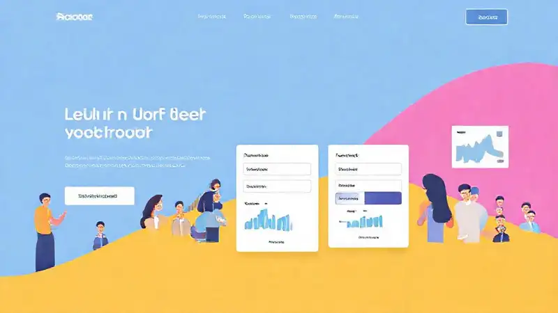
2. High-Quality Visuals & Branding
Your landing page’s visuals – images and videos – should powerfully reinforce your value proposition. Avoid generic stock photos; opt for authentic imagery that showcases the lifestyle or results your membership provides. If your membership focuses on fitness, use images of people achieving their fitness goals. If it’s about business, show successful entrepreneurs.
Consistent branding is essential to build recognition and trust. Maintain the same colors, fonts, and overall aesthetic as your website and other marketing materials. This creates a cohesive experience for visitors. A visually appealing landing page naturally draws the eye and creates a positive first impression, making visitors more receptive to your offer.
Consider using video to demonstrate your membership’s benefits or showcase testimonials from existing members. Video is incredibly engaging and can convey information more effectively than text alone. Optimize your images for web speed – large, uncompressed images can significantly slow down your loading time, leading to a high bounce rate. A quick, impactful, and visually compelling design is key.
3. Compelling Call-to-Actions (CTAs)
Your call-to-action (CTA) is the direct instruction you give visitors on what to do next. It needs to be prominent, visually distinct, and persuasive. Avoid generic phrases like “Submit” or “Learn More.” Instead, use action-oriented language like “Join Now,” “Unlock Exclusive Content,” or “Start Your Journey.”
Make your CTAs stand out using contrasting colors and strategic placement. The most effective placement is typically above the fold – visible without scrolling – but strategically placed CTAs lower down the page can also be effective. Use buttons with rounded corners and plenty of white space to make them easily clickable. Consider A/B testing different CTA variations to determine which performs best.
Don’t overwhelm visitors with too many CTAs. Focus on one primary CTA – the most important action you want them to take. Guiding the user’s eye and limiting choices can significantly increase conversion rates. Ensure the CTA leads to a dedicated signup page that’s streamlined and easy to use – a seamless transition is vital to a successful signup process.
4. Social Proof & Testimonials
People are more likely to trust a product or service if they see that others have had a positive experience. Incorporating social proof can dramatically increase conversion rates. Display testimonials from satisfied members, highlighting the specific benefits they’ve experienced.
Showcase membership numbers – “Join over 10,000 other marketers!” – to demonstrate the size and popularity of your community. Display logos of reputable companies or publications that have featured your membership. If you have case studies showcasing successful student outcomes, include those as well.
Don’t rely solely on generic testimonials. Authentic, detailed accounts of how your membership has positively impacted people’s lives are far more persuasive. Consider video testimonials for an even greater impact. Building trust through social proof can alleviate concerns and encourage hesitant visitors to take the leap and join your community.
5. Optimize for Mobile
A significant portion of website traffic now comes from mobile devices. It’s crucial that your landing page is fully responsive and looks and functions perfectly on smartphones and tablets. If your landing page isn’t mobile-friendly, you’ll lose a significant portion of potential members.
Use a responsive design framework that automatically adjusts to different screen sizes. Test your landing page on various mobile devices to ensure it’s easy to read, navigate, and interact with. Optimize images for mobile to reduce loading times. Keep your copy concise and avoid using long paragraphs on mobile.
Mobile optimization is no longer optional – it’s a necessity. A clunky or difficult-to-use mobile landing page will immediately turn off potential members. Ensure a seamless and enjoyable experience for users, regardless of the device they’re using. Prioritizing mobile is key to reaching a wider audience and maximizing your membership sign-ups.
Conclusion
Creating a high-converting landing page for your membership site requires a thoughtful and strategic approach. By focusing on a clear value proposition, high-quality visuals, compelling CTAs, social proof, and mobile optimization, you can dramatically increase your sign-up rates and build a thriving community. Remember that continuous testing and refinement are essential – don’t be afraid to experiment with different elements to see what works best for your target audience. Ultimately, your landing page is the gateway to your membership, so invest the time and effort to make it irresistible.
Do you want me to elaborate on any of these points, or perhaps focus on a specific aspect of landing page design for membership sites?