Typography is a crucial, yet often overlooked, element in website design. While stunning imagery and compelling content are essential, the way text is presented dramatically impacts user experience and, crucially, SEO. Specifically, the typography – the choice of fonts, sizes, line heights, and letter spacing – within your WordPress theme can significantly influence how easily visitors can read and understand your website. A poorly chosen typeface can lead to eye strain, decreased engagement, and ultimately, a higher bounce rate. Conversely, well-executed typography creates a pleasant and intuitive reading experience, boosting user satisfaction and positively affecting your site’s performance. This article from de seotoday.in delves into how effective typography within your WordPress theme contributes to improved readability, and why it’s a key consideration for any web designer or content creator.
Selecting the Right Font Family
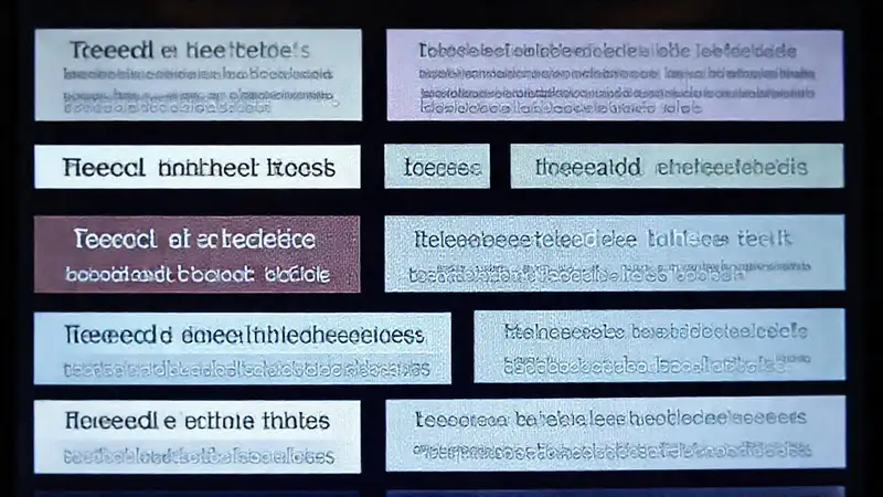
Choosing the right font family is the first step towards improving readability. Don’t just default to the theme’s built-in font – carefully consider its legibility and how it aligns with your brand. Serif fonts, traditionally associated with print, often offer a classic and structured appearance, making them suitable for longer blocks of text like blog posts and articles. Fonts like Times New Roman or Georgia are well-established choices and offer excellent readability. Conversely, Sans-serif fonts, like Arial or Helvetica, are commonly used in digital environments and are frequently perceived as cleaner and more modern. They’re often a good fit for headings and shorter paragraphs.
However, it’s not just about classifying fonts as serif or sans-serif. Consider the specific characteristics of each font. Some serifs are more delicate and can appear cramped in smaller sizes, while others are bolder and offer greater clarity. Similarly, some sans-serif fonts can appear too thin or rigid, making them less inviting for extended reading. Researching different font combinations and testing them on your theme is vital before committing to a final selection. Remember, consistency is key – limiting yourself to two or three font families within your website will create a more polished and professional look.
Mastering Font Size and Line Height
Beyond the font family, font size and line height are critical factors in readability. A font size that’s too small will strain the reader’s eyes, while a size that’s too large can feel overwhelming. A general guideline is to use a font size of at least 16 pixels for body text, but this can vary depending on the font and overall design. Regularly test your font size on different devices to ensure optimal readability across platforms.
Furthermore, carefully adjusting the line height, also known as leading, significantly impacts the flow of text. A line height of 1.5 to 1.7 times the font size is generally considered optimal for comfortable reading. This spacing allows the reader’s eye to rest between lines, preventing eye fatigue. Insufficient line height can lead to a “stair-step” effect, making the text feel choppy and difficult to follow. Don’t be afraid to experiment – a little tweaking can make a significant difference in the overall user experience.
Letter Spacing and Kerning
Often neglected, letter spacing (tracking) and kerning are important techniques for enhancing readability. Letter spacing refers to the overall space between letters in a word, while kerning adjusts the space between specific pairs of letters. Too little letter spacing can make text feel cramped, while too much can make it appear disjointed.
Kerning is particularly important for creating a visually balanced and polished look. Automatically kerned fonts often fail to address subtle inconsistencies between letter pairs, resulting in an uneven appearance. Manually adjusting kerning – particularly in headings and important text – can significantly improve the legibility and aesthetic appeal of your typography. Many WordPress theme customizers provide tools for adjusting these parameters, allowing you to fine-tune your design.
Contrast and Color Considerations
The contrast between your text color and the background color is paramount to readability. A stark white text on a white background is difficult to read, as is a dark text on a dark background. Aim for a high contrast ratio – ideally, a ratio of at least 4.5:1 for body text.
Consider your website’s overall color scheme when selecting text colors. Black text on a light background is a classic and highly readable combination. However, don’t be afraid to experiment with muted colors, provided they maintain sufficient contrast. Tools like WebAIM’s Contrast Checker can help you verify that your chosen colors meet accessibility guidelines and ensure a positive reading experience for all users.
Conclusion
Ultimately, prioritizing typography within your WordPress theme is an investment in your website’s usability and SEO. By carefully selecting fonts, mastering font size and line height, paying attention to letter spacing and kerning, and considering color contrast, you can significantly improve readability and create a more engaging experience for your visitors. Remember that a well-designed and readable website will not only keep users on your site longer but also improve your search engine rankings – a win-win situation. Utilizing tools like the customizer within your WordPress theme and the resources offered at de seotoday.in can provide invaluable guidance in achieving optimal typographic harmony and maximizing the impact of your website’s visual presentation.